


Feature

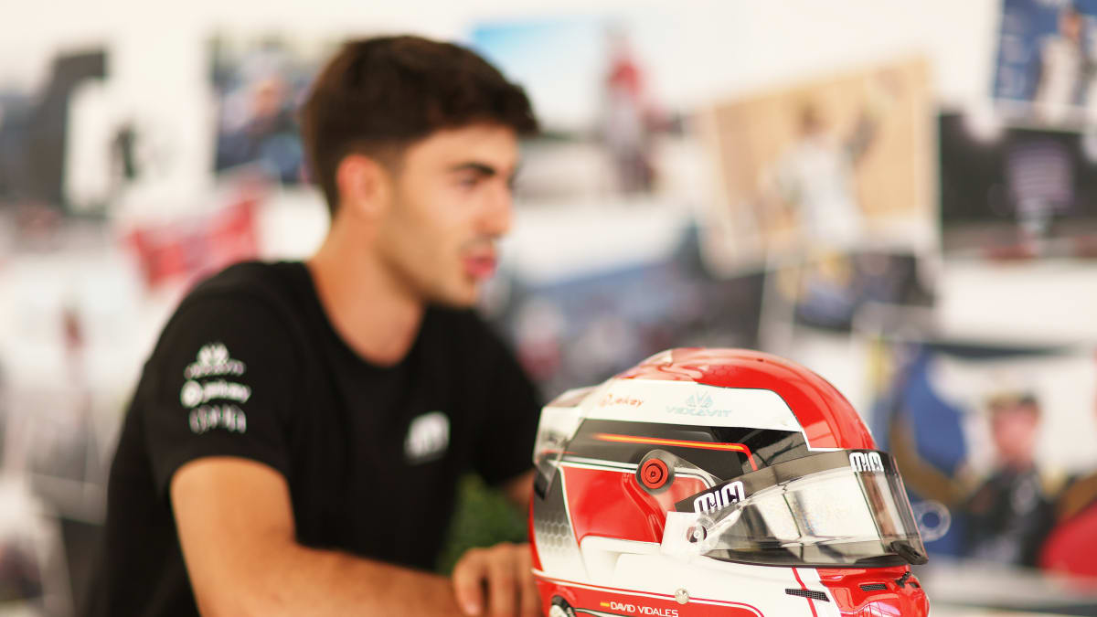
Sticking close to his karting roots and Spanish heritage, David Vidales has got a bit of a theme going with his helmet designs over the years, but you might have spotted more than one design on track this season.
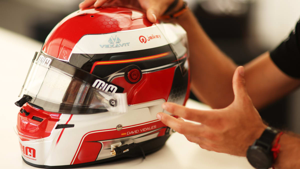
Easily to recognise on his onboards, the Campos Racing star talks us through his 2022 crash helmet design, his unique logo and why he’s saved the design for those not-so rainy days.
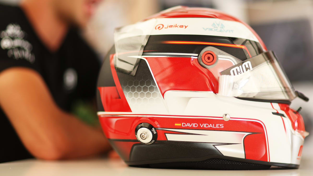
“The helmet is always personal; every driver has their design and its history. For this year, I wanted to take all the parts I liked from my previous helmets and some of the parts are from helmets I used back when I was nine years old. I’ve gone back to my original colours with red and white, whilst adding black, which I think is quite nice. It’s my original design with all the best parts from what I’ve had before.
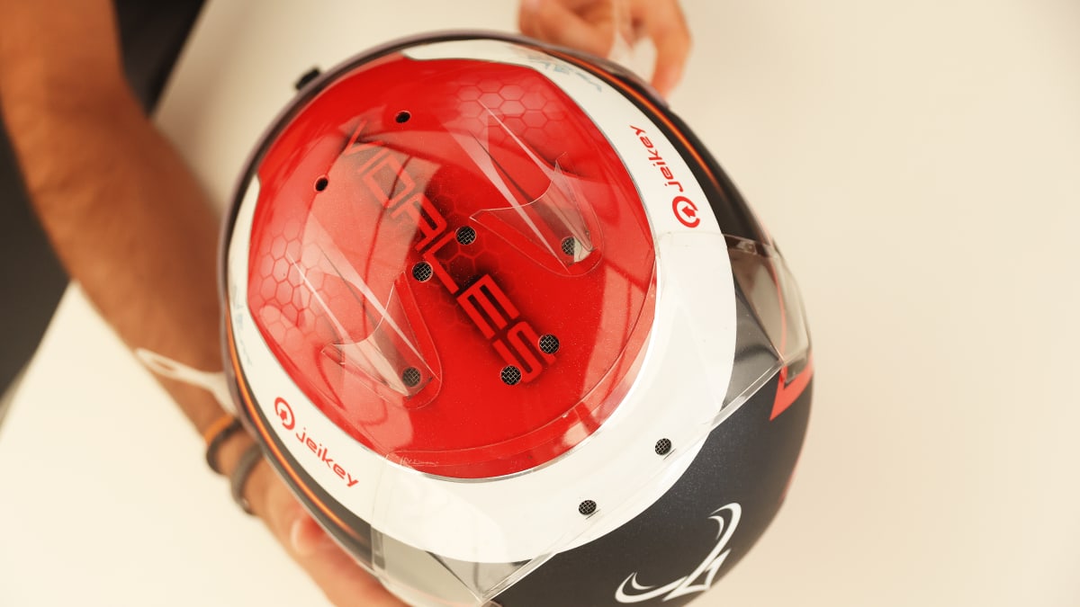
“On the back, I have my logo which I have had for a couple of years. Then on the side, I have the Spanish flag which I’ve always had on my helmets. I’ve changed some things on every helmet that I’ve had, but the Spanish flag was always here. Then I’ve got my surname on the top of the helmet, which I think quite nice as on some of the onboards you can see the name. It’s simple with the three colours and the white is matte, it’s a bit of a contrast to the black. Also, I’ve got my sponsors here – Monaco Increase Management, Vexavit and Jeikey.
READ MORE: Hitech Grand Prix confirms Gabriele Mini for 2023 FIA Formula 3 season
“I started racing when I was five years old, so my helmet was a bit more animated – not like this one. When I did my first Spanish Championship, my helmet already had more lines and it was really, really similar to this one, especially the parts at the bottom which are exactly the same. I just kept it the same as it was as I really like it. Also, when I look at it I want to remember all those years.
“Now it’s a bit more my design because I’ve always had it, but I remember when I was young, I was trying to look at different drivers’ helmets and I took some parts, then mixed everything together. I always liked to come up with my own design, so every time I drew my helmet design and sent it to the painter. I never said to the painter to design it themselves, I wanted to draw it myself and then build something from my idea.
“For my logo, I needed some help from my sister and some people around me because it was quite difficult to combine the D and the V – the two letters from my first name and surname. The bull is quite typically a Spanish animal, so the horns of the bull represent where I come from in Spain. Then the bottom bit is like a V for Vidales and if you look at from the side, it can also look like a D for David.
READ MORE: Big waves and beach living: Hunter Yeany on his hometown
“The helmet was painted by Daniel Designs, he’s an Italian guy who usually paints these Stilo helmets – which are also Italian. I think it looks pretty good!
“I always change somethings every season, but I want to keep the same things I have this year which I’ve had from my first helmets. I don’t know what I’d change to be honest! I really like this helmet; I think it’s one of my favourites.
“I actually do two helmets for every season, the other one is almost the same with the lines and details, but instead of the black I did everything in white. This one now is for the dry as I like it a bit more, the contrast of the white and the black on top is really nice.”