


Feature
Lirim Zendeli – behind the visor
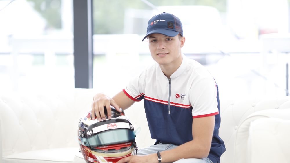
We went behind the visor with Sauber Junior Team by Charouz driver Lirim Zendeli to discuss the design of his helmet and delve into the back-story of where it all began.
The German explains why he didn’t have his own personal helmet design until recently, talks us through the patriotic look, and the video-game influence within it.
“I was always known as the ‘white helmet man’ when I was a child laughs. As a family, we didn’t have such a big budget, so when we started karting, I had three years of the same helmet, just plain and white – sometimes I would change the visor. At one point, my team boss in karting, he gave me a painted helmet and that was my first one. It was black and yellow, I still have it at home.

“After that, I drove for BWT Mücke and their helmets were pink, so mine was pink. It wasn’t until last year that I had my own painted helmet, which was built around my ideas of a design and the colours that I wanted. For my father, it was not really worth it because for him, it was just about driving. When I told him that I wanted to have a painted helmet, it ended in a discussion where he said that it was unnecessary because it doesn't make you faster. To be honest, at the end of the day, that’s true!
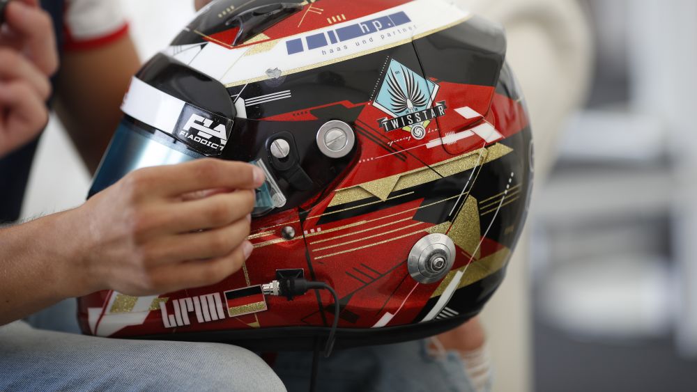
“As for the design now, it came from a video game. I can't really remember the game, but I think it was a Call of Duty one. Basically, when the game was loading, these lines came up on the screen, like you see now on my helmet. I spoke to my designer and he told me that this type of design is called “glitch.” The way to describe it, is that at first glance, nothing looks to be in order, but if you look closer, it all fits in. I didn’t want to have a standard design, I wanted to have a helmet that people hadn't seen before.
“There are some eyes on there as well, just above the visor. The helmet features my sponsors and my logo on there too. I have the F1.Addict Instagram page on there as well, who I work with sometimes. They post a lot of things about me and it’s good promotion. It is also cool for them to work with a young driver, I think.
“It uses the colours of Germany, so you have black, red and golden. However, it is not just Germany: if you take off the gold, then you have black and red, which are the colours of Albania. Everything fits, and I think that if someone knows me, then they would immediately see what I want to say.
“We worked on a few different logos, before we ended up with this one. I actually wanted something else, which used the L and Z and made them into the shape of a race car, but we weren’t sure if it would be a copy of something that someone else had already done before. The other idea I have since had is to use the L and the Z to make a number 7 – that is maybe something for the future.”