


Feature
Celebrating his Japanese roots: The story behind Reece Ushijima’s helmet design
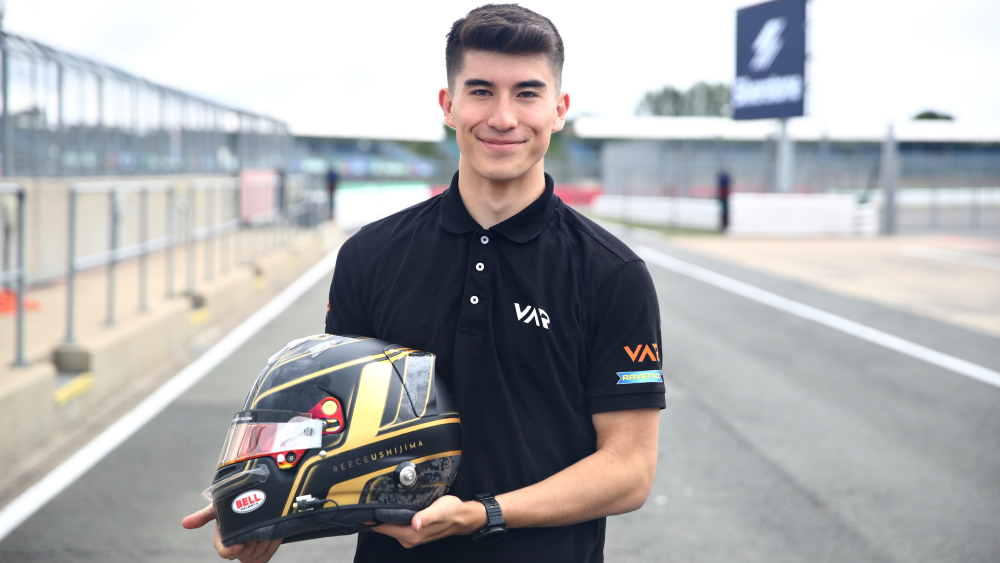
There’s no mistaking Reece Ushijima’s helmet when he’s out on track. Sporting a stylish black and gold look, there’s a lot more that’s gone into his design than the aesthetics. The Van Amersfoort Racing driver is the latest Formula 3 star to go behind the visor and talk us through why it’s important for him to pay homage to his family, Japan and to represent who he truly is.
“I first started racing in 2016-2017 and back then I had a different helmet design. Then when I was switching over to a helmet the next year, I didn't know what I wanted to do so I did what I think any kid would do and just printed out a bunch of helmet stencils and just started drawing and seeing what I could do.
“And to be honest, since then I've kept pretty similar of a design in terms of a general thing. In karting I had a lot more complicated of a design but as I got to cars, I realised no one is really going to see it from a distance, so I wanted to have a staple in terms of a couple colours.
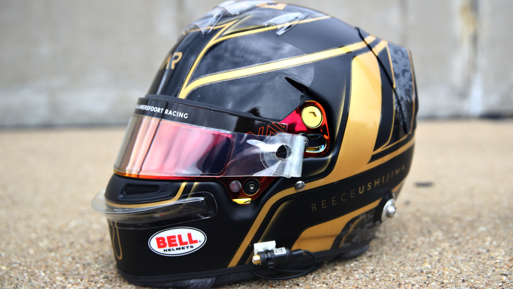
“My first ever helmet was actually blue, white and gold so it's changed quite a bit, but then I went white and gold. In karting I ran white, blue and pink for the team I was racing with, but now I feel like I can really represent what I feel at heart. I was white and gold before, but I thought it looked a bit too simple, so I went back to the black and gold which I really like. I think it suits my kind of personality in terms of a look.
READ MORE: David Vidales: My greatest influences
“Obviously I have these cherry blossoms on the back. This is just a bit of a homage to my Japanese roots, and I think cherry blossoms are beautiful as well, so that is cool to have on my helmet. Also, I have the number 13 in Roman numerals, which ever since karting I've had on the back of my helmet. It’s something I wanted to get tattooed on me or something like that, but I always ran with the number 13. Obviously in F3, you don't really have a choice in what you run, but I thought it was cool to run on my helmet.
“That's the cool parts on the back that I really wanted to implement, but everything else is just a bit of general design stuff that I thought was cool. The gold - I felt like it represented me quite well. I'm still working on different parts to kind of optimise and I have another design on the way, but we'll see with that one.

“I also have this logo at the top that my mom actually wanted me to put on, it’s something to do with my birth year I think – someone probably knows! My mum wanted me to put it on because it’s supposed to protect me when driving. I think any mother is a bit stressed about their kid racing cars.
“I moved away from home in 2018 to pursue racing and there was a point where I didn’t see them for two years because I was racing all the time, but anything I can have to have my family represented is nice.

“I kind of came up with the general design, but Brandon Seaber designed it - he actually designs the teams' cars as well and for a couple other guys down the grid. I worked with him last year at Hitech Grand Prix, so I developed a relationship with him and then it’s painted by Bell.
“I have a couple of ideas for next year, maybe I might try rose gold something like that, just a bit more of a pop. There's a couple of bits here, I didn’t like this wrapping around and a couple of sizing things that I’ve changed on this new design that I have, but we’ll have to see how that goes for next year.”