


Feature
Splashes of colour and contrast: Roberto Faria on his helmet design
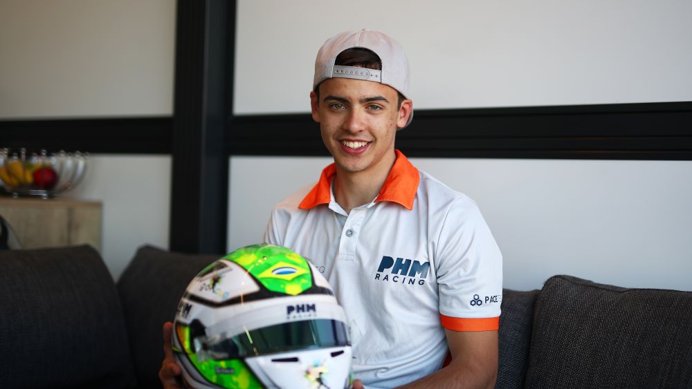
It’s one of the most eye-catching designs on the grid and that’s by design. Roberto Faria goes into all the details about his 2023 crash helmet design and how it came to be.
The PHM Racing by Charouz driver details all of his favourite parts and what he would do if Formula 3 went racing in Brazil for his home event.

“This is the very first painted helmet I’ve got. A Brazilian company did it when I was in go-karts. We tried to have my initials in the design, and then also have splashes of colours, they’re from my sponsor. Then there’s a football player with a colourful splash at the back. So when you see the helmet, it’s like someone dropped paint around it, that’s the concept.
“The first design was not really what we wanted but we kept pushing on the designs and I will give credit to the guys who came up with it, the contrasts they came up with are really nice. The first one they did it was purple and we didn’t really like it.
"So we asked if they could be a little more creative with it. The green is also good because it matches the Brazilian flag at the front, this was also a good thing. We like the carbon here on the ‘F’. To be honest, when I asked for the helmet I didn’t realise the letter ‘R’, I only saw the ‘F’. But when they pointed it out I was like ‘oh that looks really nice, that’s cool.’

“Artmix painted it, they’re a Brazilian company. We asked for the design and they came up with the first project which was purple but it was too general. There was one colour and a little bit of style to it but this one is more specific just for me.
READ MORE: Fighting to the end: F3 Summer Wrap-Up
“It goes well with the logos and the colours, sponsors and splashes, it’s perfect. It’s very vibrant. We just went back and forth and changed little bits, but then adapted to this. I’ve been with Bell since last year and they’ve been helping me which is nice.
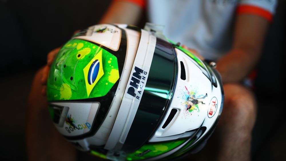
“I don’t know which part I like more to be honest. I would say that the splashes are nice because it makes the design really vibrant and it really stands out. But I think my favourite part is the initials I think. They can be quite hard to see but when you do, it looks amazing.
“If I was going to do a special design I would definitely do a Brazilian design. I would just do a yellow one and symbolise half of it like the Ayrton Senna design.”