


Feature
The eye of the tiger: Francesco Pizzi’s helmet design explained
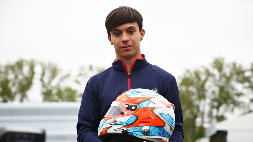
Francesco Pizzi talks us through his crash helmet design, including what is going on with that mystery moustache, last minute paint choices and some potential changes we might be seeing later this season.
What was the idea behind the design?
“I didn’t really pick one kind of design, I was just choosing to go with an aggressive line, more sharp turns, like this. The project at the start was to make this one chrome but we didn’t have it on time, so I chose white to put on top. There’s my logo at the top, the one I’ve been using since the start of single-seaters.”

Can you explain that logo?
"We designed it that way so it should look like a stylised tiger or the face of a tiger. It looked good that way. On white, it doesn’t look right but with yellow, it gives more of that feeling.
"For the colours I’ve gone for white, blue and red. The blue is ice, the fire which is the red, so it’s a light blue and the red is a strong red.
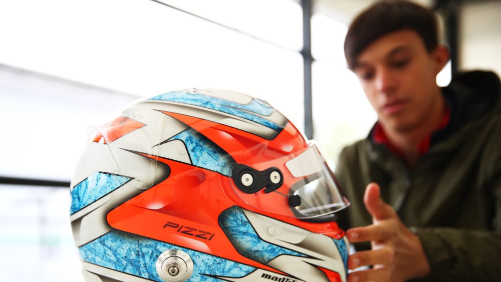
"For next year I’m preparing a texture. For the rest I wanted to alternate between this normal smooth paint and with matte. The white is matte and the blue is normal. On the front I went with just my sponsors and my helmet designer on the side.
"It all depends on how my football club does because one of my friends asked me to paint it in the colours of my football club, Roma, if we win a trophy this year. If we win the Conference League I will do it, definitely."

What is the moustache at the back?
“It is the logo of my designer. He uses the moustache. We used to race against each other, he’s a bit older than me but when I used to do karting and I was 14, we used to race in shifter karts against each other and I liked his helmets. I realised he was doing helmet painting too. He uses the moustache because he has a long moustache."
How long have you used this design for?
“This is the first season. Every season to be honest I change. Last season was a bit of a smoother kind of helmet, this one is a bit sharper. Compared to last year, which was a bit too sweet for me, I wanted to look a bit more aggressive. This year is the first and I want to develop something with the logo and maybe make it bigger on top to give it more feeling of what it means."

Anything we might have missed?
“I put a fire texture in here. I tried to stylise the back a bit more, I would like the back to be a bit different. Anyway, you never see it in a race car so it’s not important.”