

Feature

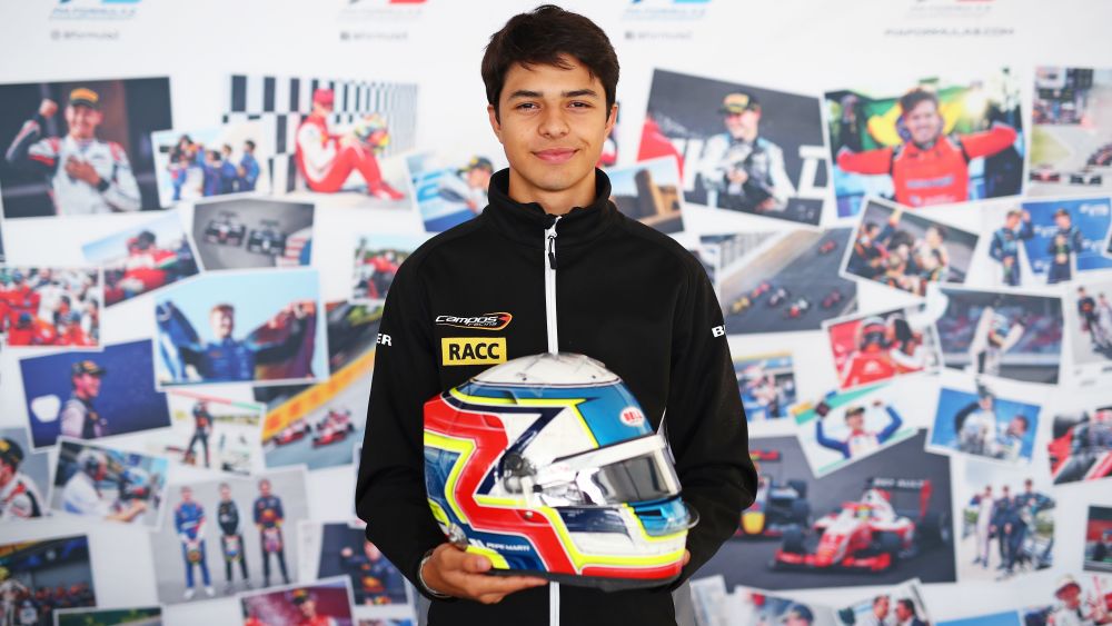
You might have spotted Josep María Martí rocking an updated helmet design during the season finale in Monza, after the Campos Racing driver became the newest member of the Red Bull Junior team.
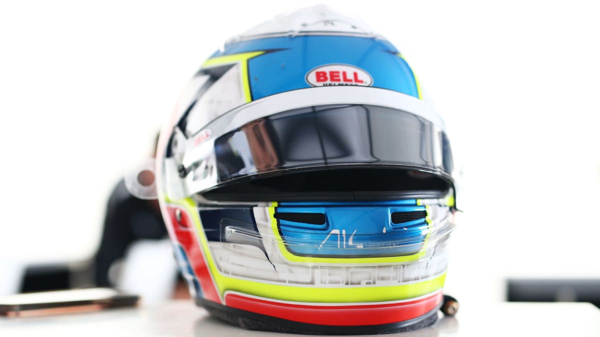
Looking back at his original helmet for the 2023 campaign, the Spaniard breaks down the home and nautical influences that inspired the design, being mentored by Fernando Alonso and showing who he is through his design out on track.
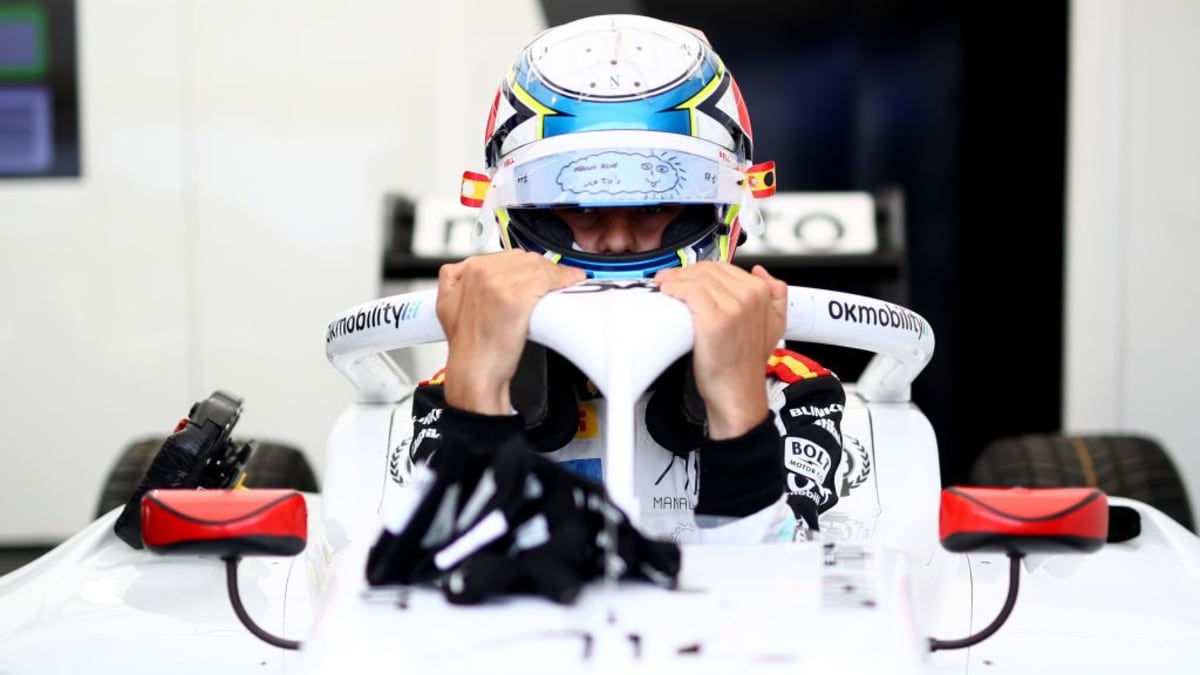
“I like to think that my helmet was on the really thought about side. Obviously, there are a lot of things at play on my helmet. From the side you get the 'S' going up with both colours from the Catalan and Spanish flag. I decided when I was 13 or 14 years old to slap both colours on, I like it this way and it’s remained like that ever since.
“On the back, I have one of my favourite parts, the skyline of Barcelona. It’s been on my helmet basically since the first design and it kind of evolved over the years. Before it was really low down, but when I went into single seaters, you have the HANS device which makes you lift up all the areas at the back of the helmet. So, the skyline has moved more towards the centre of the back and that’s something that has gone on all my helmet designs.
“At the top, I have what looks like a compass because it is a compass! Actually, the compass is one that is used by sailors called the ‘Rosas de los Vientos’. It’s the compass that sailors used back in the day and I really like the sea, the sea is one of my biggest passions. When I was a kid, you can ask anyone from my family, I was a fish and I was in the water 24/7 during the summer, so I’ve always really loved it. My mum put the idea of using it forward because I wanted to have something on the top that would remain something that I really liked, so when my mum proposed that I was like that’s bang on, that’s exactly what I want and it’s been like that ever since.
“I actually used to have the north tip painted in red because there is a saying in Catalonia to always focus north because north is obviously forward. It used to be like that, but now it’s all the same and I think it comes across really nicely. Also, I used to have ocean waves at the bottom of my helmet in karting and then on my first and second helmets, the white areas had the roadmap of Barcelona. The background was the crosses from each street, which were splattered on it. It was amazing, really cool, but to be fair, looking back it was really complex and I decided this year to just put something that was a little bit of a different touch to it.
“For the colour scheme, I have really bright colours. I used to have a really, really bright blue as well to match, but I’ve moved to a dark blue chrome. Basically, they are all my favourite colours, the only one that’s missing is orange because it never connected with anything else. I think my helmet is still evolving, I think next year’s I’ll like more and then the year after that I’ll like it even more. Obviously, it’s a helmet that is ever-changing, but I love my design.
READ MORE: Colapinto: ‘Championship fight out of reach but 2023 with MP was a success’
“I’ve always tried to keep it the same way because I think it identifies me a lot. It’s funny because people always ask ‘oh, did you take inspiration from Fernando with the colours and everything?’ To be honest, when you look at it from the outside, it actually looks a lot like it because Asturias’ colours are light blue and yellow and the Spanish flag is red, yellow and blue. It’s funny because you look at it and you’re like this is for sure inspired by Fernando, but actually isn’t. It was something that got built over time.
“Being part of A14 is a dream, it’s a pleasure and it’s everything to me to be able to say that I’m a part of Fernando’s management. Growing up, he’s been my idol forever and it’s just so cool to be able to say and something that I’ve looked forward to my whole life, to be able to say that I know Fernando. When I got the news, it was obviously a really big moment for me and my career, so it’s a big pleasure for me and a massive opportunity that I’m taking as much out of as I can by constantly learning. Thanks to them, I have a lot more at hand than I would have without them, so it's a really big help and hopefully in the future we can keep on this path in our partnership.
“I’ve always had my name at the side on the bottom and the helmet has remained quite similar over the years, but I think the colour scheme has changed. For example, the yellow at the top and going through the front is an addition for this year because I wanted to switch it up. To be fair, it’s not like I’ve switched it up massively, but there are changes here and there. For next year I was thinking of going a little bit more complex at the front because I’ve always kept it the same.
"Basically, the front has always been one colour which comes down from the sides and goes forward, with the air intakes being the edge of where the colour comes around so it’s always looked like a mouth. It’s been like that since my first helmet and it looks really nice from the front, but I think for next year I might switch it up and try to look at it with the designer to do something a bit more special.
“Personally, I’m not really creative. Obviously, I am in some ways, but I’ve never really had the touch for art like my sister has. Since the beginning, we used to say more or less what I wanted and the designer put it into place, so I’d tell them this part was a bit too much or let’s go in this direction. It’s always been a good collaboration. In the beginning, the designer was from Catalonia, but for this year the designer is actually Bell. So, the helmet was designed, made and painted by Bell. I got sent it straight away from them and from working with them and the creation of the design, it looks amazing and I’m really happy with how it turned out, so thanks to them.
“I think the helmet is probably one of the only places where we get to express who we are or what we like. From the beginning, I didn’t want it to just be lines splattered on a helmet or really dramatic. I remember there is a really iconic designer in Catalonia and there was an era where pretty much every driver in go-karts had the gearbox painted on in glitter all around the helmet. It was iconic for a long period of time and I was like, okay this is really cool but I want to go somewhere else, somewhere different. Slowly but surely my helmet will keep improving and changing.
“In the end, my taste in helmets changes every year. For example, I really, really love Lando Norris’ designs and Alex Albon’s designs. They’re not afraid of going that extra mile and trying something different, which is really cool. It’s amazing to see and something that I can hopefully do in the future.
“I haven’t really gone into the design scheme for my next helmet, but I think looking at this year’s, the front is really wide with the blue so I’d maybe like to make it a little bit tighter so it looks more colourful from the front and not just blue. I would like to add some chrome somewhere that makes it a little bit flashier. I think I won’t play as much with the design, but more with how the colours are placed, the matte effect and the glitter to have something to make it stand out.”

